
 TL;DR:
Apple's Developer Beta of iOS 26 replaces the static grid interface of iOS 18 with a highly customizable Liquid Glass design featuring transparent app icons, spatial depth effects, and edge-to-edge content flow for users who prioritize visual dynamism.
● iOS 26 is best suited for users wanting interactive elements like morphing clock numerals and real-time adapting Dynamic Tab bars, whereas the iOS 18 layout remains optimal for users who prefer minimal visual complexity and fixed row-and-column navigation.
● While the iOS 26 upgrade offers enhanced personalization through an All Clear mode, early adopters report limitations including device overheating, increased battery usage, and navigation difficulties caused by the transparent interface.
● Users migrating to an upgraded iPhone can bypass manual lock screen customization by using MobileTrans to directly transfer their existing home screen configurations, a process that supports cross-platform data restoration across 6,000 device models.
Ask AI for a summary
 ChatGPT
 Perplexity
 Gemini
 Claude
 Grok
Grok
With the latest Apple operating system update, many people are switching from iOS 18 to iOS 26. The new upgrade has introduced various advancements within the system, as well as changes to the layout. From customizable widgets to designing the apps' icons, the new update provides a more dynamic Home and Lock Screen. However, iPhone users have started comparing the new iOS with the older version, and there are mixed reactions.
Whether you're excited about the new interface or nostalgic for the familiarity of iOS 18, this article will guide you through everything you need to know about the new upgrade. Read this article till the end to learn about the iOS 26 Home Screen and what new it has in store for the users.
In this article
Part 1. What Is New in iOS 26 Layout and Its Liquid Glass Home Screen
Apple has just released the Developer Beta of its new iOS 26, and people are wondering if they have missed the operating system versions in between. However, the reality is that the company has decided to name the new OS according to the upcoming years. Besides the name change, there are various new features and upgrades that users are enjoying.
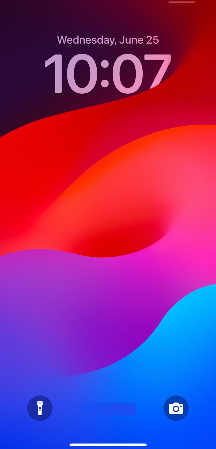
From a new eye-catching Home Screen to a more productive Control Center, the new operating system has a lot in store. iOS 26 Lock screen focuses heavily on user personalization and visual dynamism. The Liquid Glass design allows users to customize the home and lock screen with a clear glass look. Even the apps' icons can be customized to a glass look.
Part 2. How Does the iOS 26 Home Screen Compare to the iOS 18 Home Screen
Apple is switching from a simple layout to a more dynamic design, making the differences between iOS 26 and iOS 18 more noticeable. Let us explore how the two versions differ from each other in terms of design and other aspects:
1. New Design Language: Liquid Glass
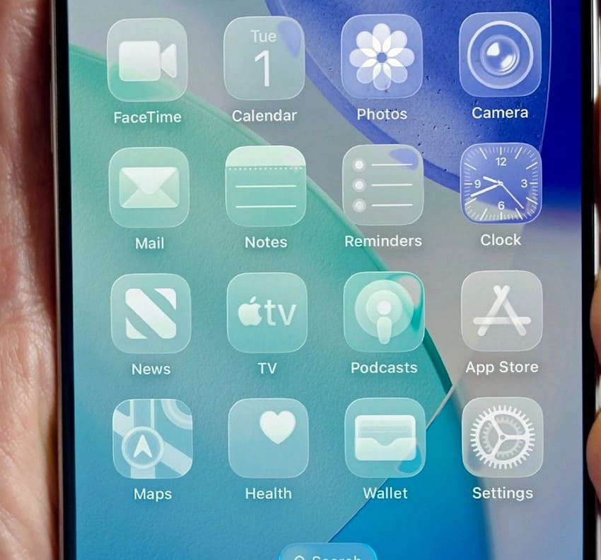
One of the standout features of the new iOS 26 Home Screen is its Liquid Glass design language. It replaces the flat and minimalistic look with a more dynamic user interface. The goal of this design revamp is to make the screen look bigger and accessible. The latest clear user interface allows the web pages to float edge to edge, enabling you to see more of the page.
2. User Interface & Layout
Dynamic Tab Bars
Another major highlight of the new iOS version is the introduction of Dynamic Tab bars, which shift in real-time, depending on your activity. It creates a more intuitive experience while freeing space for your content. They have a collapsing functionality that hides on a scroll and reappears when needed. The sidebars are fluid in applications like Safari, whereas the interface dynamically adapts to dark, light, or clear conditions.
Control Center
The Control Center buttons in the iOS 26 layout are slightly opaque to make it convenient for users to see the different control options on a multicolored background. Its opaque look complements the standard app icons and the glass icon style. The camera has a more intuitive design with a simpler layout. Moreover, new filters have been added that take advantage of the new Liquid Glass aesthetic.
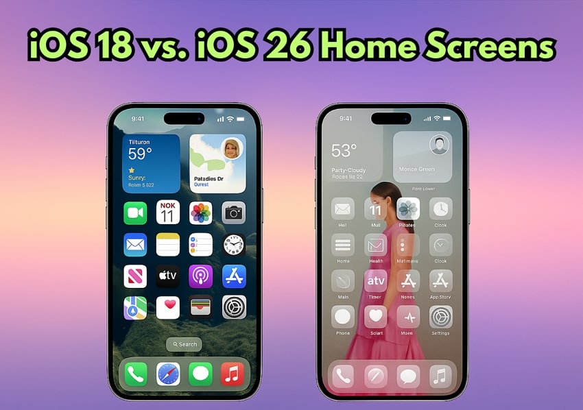
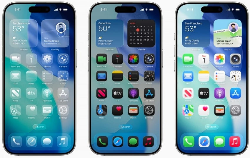
3. Lock Screen/Home Screen Comparison
iOS 26
The iOS 26 Home Screen offers a more personalized and interactive experience for users, featuring transparent icons that add a sheen to their edges. You can opt for the "All Clear" mode to let the Liquid Glass Home Screen shine. It allows more personalization options to enhance accessibility while using the phone.
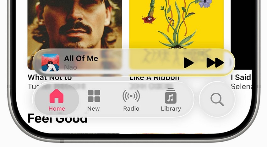
You can adjust the widgets and app icons according to your preferences, just like the previous operating systems. With the new UI, more dynamism has been added to the Lock Screen, such as dynamic font, 3D effects, and the interface of the "Now Playing" utility. The new version of the operating system has an on-device computer vision that generates spatial depth from your photos.
This gives a 3D effect to the images added as wallpaper on the screen. The clock on the Lock Screen has numerals that morph in height and width according to the subject in the wallpaper's photo. Additionally, the widget is more dynamic as it gently animates in sync with the playback.
iOS 18
As compared to the latest update, iOS 18's layout has simpler and more static Home and Lock Screens. It shows the time and date along with the notifications. The customization is limited to changing wallpapers and opting between the light and dark themes. The live phone activities are minimally optimized and are not as dynamic as iOS 26. You can access the camera and flashlight even when the phone is locked by swiping the desired option.
The apps on the Home Screen are locked in rows and columns and are restricted in size and position. There is no edge-to-edge content flow, and the overall feel is static as compared to the newer iOS version. Users who prefer simplicity appreciate the iOS 18 layout as there is no visual complexity.
Part 3. iOS 26 vs. iOS 18 Home Screen: Users’ Attitudes Toward the Two Designs
With the functional and visual differences between the two operating systems, it is essential to know how users are responding to these changes. Let us explore how different users have perceived this operating system's evolution:
1. Early Praise
The early adopters have responded positively to iOS 26 and its visual richness. Many of them have appreciated the sense of fluidity and depth in the interface. The simpler camera design has been positively received, especially by the users who prefer a minimalist design. Overall, the early praise suggests that iOS 26 offers a refreshing upgrade with growing user demand for personalization.
A user commented on a YouTube video, praising the iMessage and FaceTime updates, as they are looking forward to the color change in the messaging app:
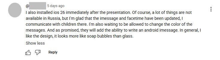
Another user on Reddit praised the Camera update while comparing it with the iOS 6 Camera, which was simple yet convenient. In the reply, another user commented that he loved the old icon designs coming back.
2. Criticism and Concerns
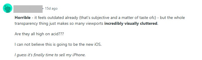
Despite all the early praise, iOS 26 Lock Screen and other features are experiencing backlash from a few users. Some users feel that the new dynamic interface adds unnecessary complexity to a straightforward system. Others argue that the Liquid Glass feels more transparent, which makes the interface more difficult to navigate.
A user on Reddit commented that they do not like the transparent layout, and it already feels outdated:
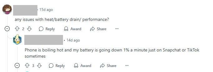
Another user complained about the battery usage and said that their phone has been overheating since the iOS update.
3. Balanced Views
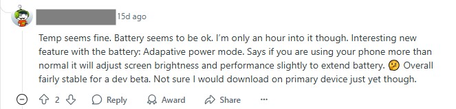
Besides positive and negative feedback, there are many users who have balanced views on this iOS upgrade. Some users are praising features like the Liquid Glass design, while others are worried about the potential downsides, such as increased battery usage. Overall, the iOS upgrade represents a bold shift toward a more expressive and customizable system that excites early adopters.
An unbiased comment was made by a Reddit user who says that they are okay with the layout and battery. However, they are not sure if they download it on the primary device or not.
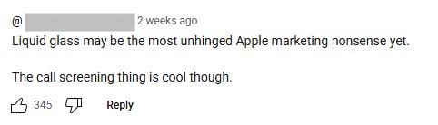
Another person commented on a YouTube video that they are not happy with the Liquid Glass screen but are looking forward to the new call screening feature.
Part 4. How to Optimize Your New iOS 26 Home Screen Design
Now that you have explored the user feedback and differences for the iOS 26 layout, let's have a look at how to optimize the home screen design. Mentioned below are the steps for customizing and navigating through the Home Screen and Lock Screen for a more efficient experience:
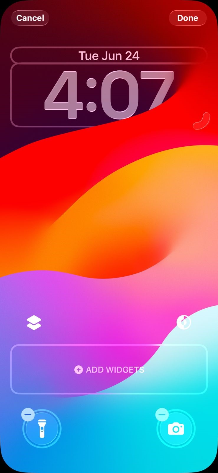
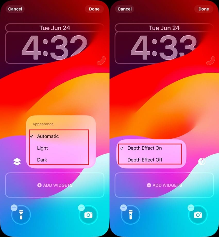
Step 1. Long-press the Lock Screen > Choose the "Customize" option. Tap on Watch > Adjust the watch's color.
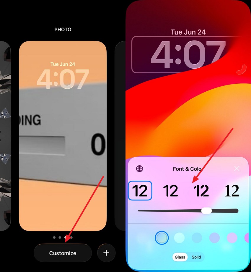
Step 2. Change "Appearance" from the right. Enable/Disable "Depth Effect" from the right. Press "Done" when customization is completed.
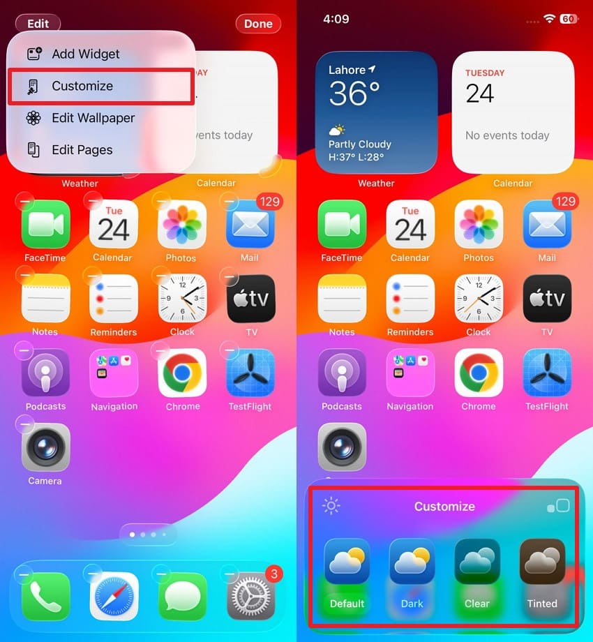
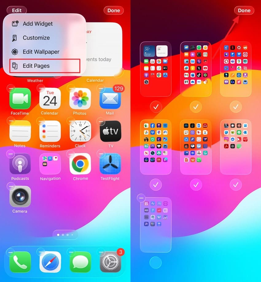
Step 3. Long-press the Home Screen > "Edit" > "Customize." Choose Layout from the bottom of the screen.
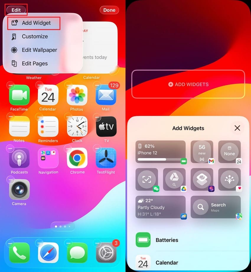
Step 4. Tap "Edit" > "Add Widget" > choose the widget of your choice.
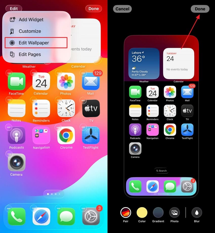
Step 5. Choose "Edit Wallpaper" > Select the wallpaper option and hit "Done."
Step 6. Press "Edit Pages" > rearrange pages > "Done."
Pro Tip. Transfer Your iPhone Layout to a New iPhone With MobileTrans
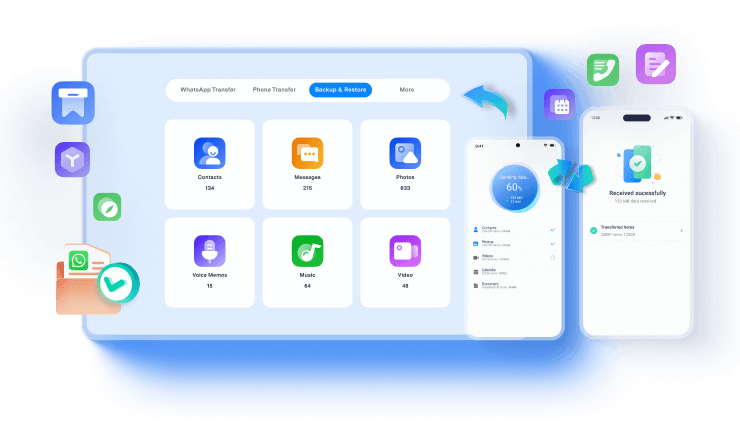
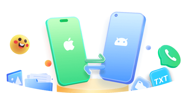
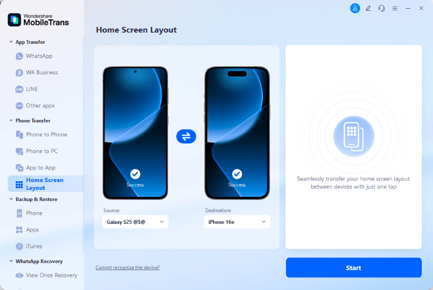
For users who want to try the new iOS 26 Lock Screen on a new and upgraded iPhone, transferring data from an old phone is challenging. With tools like MobileTrans, the process is simplified as you can conveniently transfer all your data, including home screen layout, from your old iPhone to a new one. The tool provides support for more than 6000 devices and up to 18 types of data.
Besides data transfer, you can create backups for multiple types of phone data, such as messages, contacts, even iOS settings, and more. Additionally, it supports multiple operating systems, including iOS and Android, to enable cross-platform data restoration.
Steps for Transfer iOS Home Screen Layout With MobileTrans
Step 1. Connect your old iPhone and press "Home Screen Layout" from the Phone Transfer section. Click "Start" to proceed the transfer process.
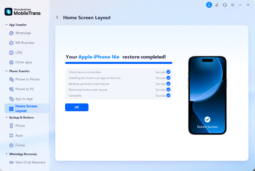
Step 2. Wait for some seconds and the home screen layout is transferred to your new iPhone.
Conclusion
To wrap it up, this article provided a detailed review of iOS 18 and iOS 26 Home Screen with various functionalities discussed. It also presented a closer look at various user reactions, ranging from positive feedback to critical concerns.
However, if you are planning to upgrade to a newer iPhone with the latest iOS update, you can back up and restore your phone's settings and data efficiently with tools like MobileTrans.